Friday, 30 October 2015

Film and Character Ideas

"Geoff is a normal guy in his early 20's who hates his job and hates his life even more. He has a horrible boss, annoying neighbour, no money and no girlfriend. In a bid to impress a girl he learns to lucid dream which changes his life; he can now control what happens to him in this new dream reality. This quickly becomes an addiction as he loves the power he has in the dream world and slowly loses the ability to distinguish between reality and fiction. What could possibly go wrong?"

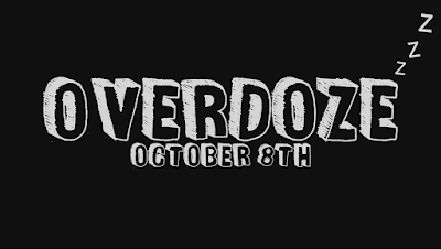
This is the current working synopsis for our film "Overdoze". The name is intended to be a play on words of overdose as our character overdoses on lucid dreaming and after overdoing it and lucid dreaming too often losing the ability to distinguish between reality and fiction. This was intended to create humour through the play on words and also subtly suggest the theme of sleep in the film by using 'doze' instead of dose. The screenshot above is the current title we are using at the end of our spot trailer. I added the little z's at the end of the E to enforce the idea that sleep plays an important role in our film and to add some more character to the title.

Geoff is the main character in our film, we follow his life as he is overloaded with work from his boss and is ignored by his fellow colleagues until he becomes lonely and bored, tired of his day to day until he becomes sad and reaches a low in his life. He's had his eye on a girl he knows for a while and has a massive crush on her but is always too awkward to talk to her or ask her out. After finding out the girl he likes is a hippie and is trying to learn to lucid dream, he attempts to learn it himself in order to create something between them that could draw them close together. Somehow he manages to crack it and discovers a wonderful world in his dreams where he can control his life and replay scenarios where he has been picked on or made to feel useless in real life, changing what happens to make himself more important and a more confident person. This starts to impact his real life as he builds his confidence and starts making friends and changing his life so he is happy. He punches his horrible boss and kicks his neighbour's dog, even asking out the girl of his dreams. The lucid dreaming impacts his life positively as he improves his real life quality by building his confidence in this fake reality.

Friday, 23 October 2015

Distributors Research


Sony logo.svgA distributor is responsible for the marketing of a film, the distribution company are responsible for advertising the film, setting the release date and decided which platforms it will be released on and at what times. The distribution company normally owns a range of subsidiaries which are involved in the distribution process, for example, a chain of cinemas or an independent viewing house. In our case, Columbia is owned by Sony who are a huge company who own a range of companies that would be helpful in distribution including Sony Entertainment Network and the PlayStation store, these will help as they can sell the film over the PlayStation network store. Also the Song Entertainment Network could distribute our film onto the televisions, computers, home cinema systems, phones and more in order to reach a large target audience.

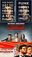
I have chosen Columbia Pictures for my distribution company, while researching the various companies who have been involved in films similar to the one we are hoping to create I found out that Sony Columbia were responsible for The Interview, Pineapple Express, The Social Network and many more films which have a similar sense of humour, storyline or characters to the film which we are creating a trailer for. I watched the Columbia Pictures title and decided it would fit with the trailer, when watching the Columbia title I instantly recognised it due to the fact that the Columbia logo has been used in lots of films for many years. I think this
is good for our film as the well known and widely recognised Columbia logo has become associated with quality films and seeing it before our trailer could make people assume a certain quality.

Monday, 12 October 2015

Poster Analysis - Shaun of the Dead

The poster for Shaun of the Dead is a little more simplistic than the poster for The Wolf of Wall Street with the only busy part of the poster being the zombies crowded together behind the doors. Having the zombies pressed up against the door like this suggests that the person viewing the poster is behind the doors, safe from the zombies, surviving the apocalypse along with the cast and stars from the film. This makes the viewer feel involved in the action and makes an effective poster. The title is in a large bold font with a zombie hand forming the 'A' in 'DEAD' to make the title more unique and show one of the most obvious themes of the film, the zombies. 
Underneath the title is the tagline, "A romantic comedy, with zombies." This title uses juxtaposition as zombies do not fit in a stereotypical romantic comedy, this creates humour and entices the viewer. The question "Ever felt like you were surrounded by zombies?" Is a rhetorical question to make the viewer try to relate to the film. 

The colours used consist of mainly dark reds, blacks and browns. This fits with the theme of the film as it is meant to appear like a horror film, the genre it is parodying. This creates an eerie feel and makes the film seem dark and disturbing, as the creators are well known for humour the audience can recognise that this is a parody of a zombie film and not a genuine horror film about zombies, helped by the humourous tagline and the actor standing awkwardly in amongst the zombies.

Poster Analysis - The Wolf of Wall Street

The poster for the film 'The Wolf of Wall Street' immediately came to mind when thinking of movie posters as it had stood out to me when the movie was released. I thought this would fit our film as it is all about the main character's mundane, boring office life and I thought of ideas regarding my own film, mimicking and parodying the style of this poster. I thought of doing two posters in one, showing an identical image very similar to this one with the protagonist standing in his office with people working and his boss shouting at him as he stands looking unhappy and then doing a version where he is in the same position in the same location but in his dreams. This would differ as he would be smiling happily and his boss would be handing him money or offering him a promotion and he had an attractive girl next to him as the office behind him was on fire and his coworkers gone. This is supposed to show how he resents his office job and coworkers and how he can live out his dreams when he is asleep even if his dreams are unrealistic.

The colours used in this poster are very friendly with bright yellows, blues, whites and reds breaking up the otherwise grey of the office to show excitement at his achievement and the light-hearted happiness the viewer is made to feel. At the bottom of the poster we see the information regarding the cast, production and even release date. This is a common part of most posters as it gives the viewer the information needed to find out more about the film, the people in it or any of the people or companies involved in making it. Becoming more common is the usage of social media accounts so the viewer can follow the film and view exclusive material from behind the scenes.

Poster Analysis - Kick Ass


The poster for Kick Ass consists of a black background with the films title Kick Ass in large yellow letters taking up the majority of the space. Overlaid on this is the portraits of the main characters in the film including Kick Ass, Red Mist and Hitgirl. The main colours used are the black of the background and the yellow of the title, this combination of colours works extremely effectively as they are the same colours that you see on a wasp or a bumblebee as they have connotations of danger in nature. This suggests that there is an element of danger to the film which we see in the fight for survival that Kick Ass faces when he has to confront villains and criminals who want him dead. This also suggests that the film will be action packed and adrenaline filled which draws fans of the action genre to view the film and to be attracted to the poster. The overall art style is very active with lots of incredibly bright colours including yellows, blues, greens, reds and more all with a very high contrast which shows the high energy in the movie which fits with the poses they are striking, all looking on edge and ready to fight, intimidating the viewer, almost challenging them to watch the film. 

Information wise, there is a tagline under the title and images which is meant to provide a small sneak peak at what to expect in the film with the actors names above the title to let people with a potential interest in the film or the actors identify who is acting in the movie and who plays each role, this can attract followers of each of the actors and also give a film a higher status and make it more popular if it contains a selection of well known actors. Right at the bottom of the poster we see the production credits and release date, the release date is larger than the rest of the text and is in a bolder font with a different colour as well as being in all capitals to draw the viewers eyes so anyone who is interested in the film can know when they can see the film, building hype for the release. The rest of the text is credits for companies and people involved in the production and release who do not necessarily need their name to stand out and are only there for legal purposes or to offer information to particularly intrigued viewers with a deep interest in the film.

I think the design of the poster is incredibly good at attracting the right audiences as they are targeting fans of the action and superheroes genre and the bright colours and action poses on the poster along with the badass tagline "SHUT UP. KICK-ASS." Promise an action packed, intense superhero movie to satisfy the audiences want for adrenaline. At the same time, it also offers the necessary information for the viewer to find out more and learn about the actors or companies responsible for the film.

Tuesday, 6 October 2015

Magazine Cover Analysis - Mainstream and Independent

This is the cover of empire magazine for the film I have been looking at as an inspiration for our trailer, Scott Pilgrim vs The World. This is an example of how a mainstream magazine would use the front cover of their magazine, Empire, to show off and promote a new film. Therefore if we decide to use Empire magazine for our trailer, we will need to use a similar style and learn from this. The whole magazine has a fairly fun feel to it with bright colours, big text in different fonts and comic book style appearance fitting with the film being advertised.


For my independent film magazine cover I chose a magazine called MovieMaker which is less popular than Empire and is more traditional. The magazine looks much more formal and professional than the cover of Empire with more text, a more formal looking font, dull colours and lots of text. This makes the magazine appear more uninteresting and appeals to a different, more interlectual audience. Depending on the target audience and likely production company of our film we will choose a style of magazine to use as inspiration for our own.

Thursday, 1 October 2015

Moodboard and Explanation


This is my mood-board showing the influences and themes of the film that I'll be making a film for, in the film the main character works in a boring office job and uses lucid dreaming (controlling your dreams) to live out his perfect life while he is asleep causing him to sleep his life away to avoid his mundane real life.

Picture 1 shows how the main characters imagination provides an escape for him and how his mind is filled with potential, this shows how Geoff uses his imagination when lucid dreaming to escape his life and envision one which he prefers.

Picture 2 is simply a picture of an office as the main character is stuck in an office job that he despises and this is why he wants to escape, this links to picture 4 as this is meant to be a picture of his boss who causes him constant stress by making his work life unbearable.

Pictures 3 and 8 are about dreaming to show how he has become reliant on dreaming in order to get by and the sky and clouds show how Geoff always has his head in the sky and loses his ability to focus on real life problems.

Number 5 and number 7 I have included because in the dream sequences in our film trailer I want to include comic book style sound effects with visual words like "POW" and "BANG" to emphasise that he is in a dream and also because it adds a comedic aspect. We got this idea from the Scott Pilgrim film which is why I have included the image of Scott Pilgrim and the girlfriend showing our inspiration.

Hidden behind all the images is the background of a sky, seen behind the image of Scott Pilgrim and behind image 7, the "WHACK!" This is meant to show how Geoff always has his head in the clouds and once he learns to dream he needs to bring himself down to earth and focus on improving his real life.